Turning Vessel Data into Portable Analysis Datasets
navIQore's Export & Visualization tool lets users define, filter and export vessel datasets for offline analysis, and build reusable multi-axis graph templates without leaving the platform.
- Context
- Export
navIQore introduces data-export functionality that lets users pull selected vessel data out of the platform for offline analysis, reporting and integration with external engineering workflows — built around the same Export & Visualization tool used internally for diagnostic work.
A dataset starts with a definition step: choose one or more vessels, a period defined either by calendar dates or by a specific voyage, and the variables to include — organised by domain (navigation, engine, system, performance) and searchable rather than scrolled through as a flat list, with optional unit conversion and running-average smoothing. Filters can then be layered on with operators such as minimum, maximum, equals, is-available or variation-threshold, each with its own buffer window, and the resulting data can be aggregated as raw samples or rolled up to minute or hour intervals.
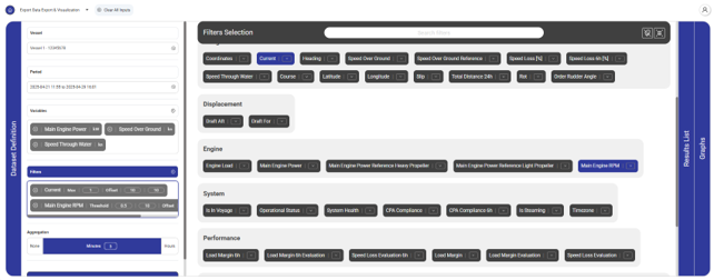
The matching results appear as a scrollable, timestamped table with units shown alongside each column, rows selectable and conditionally highlighted, and one-click export to CSV or JSON for use in spreadsheets, reports or a third party's own analysis pipeline.
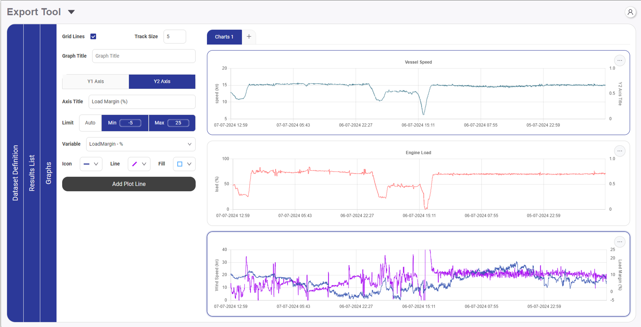
The same tool doubles as an advanced plotting workspace. Variables can be assigned to a first or second Y-axis so readings with different units or scales — say, load margin in percent against vessel speed in knots — sit naturally on the same chart, with per-graph control over title, axis labels, line colour, fill and gridlines. Multiple graphs stay synchronised on a common time axis with shared zoom and pan, and because a graph's configuration can be saved and reused, a figure built once — for a specific KPI, a specific vessel type, a recurring report — becomes a template rather than something rebuilt from scratch each time.
Together, dataset export and reusable graph templates turn navIQore's raw vessel data into something a user can take with them — into a report, a spreadsheet, or a deeper piece of engineering analysis — without losing the structure and context built into the platform.