A New Fleet Overview for navIQore
navIQore introduces a redesigned main dashboard that brings fleet-wide position, status and performance information together in one view, alongside a focused overview for monitoring any single vessel.
- Context
- UI
navIQore introduces a redesigned main dashboard that gives operations and technical teams a shared, at-a-glance view of the whole fleet, with a focused per-vessel overview one click away.
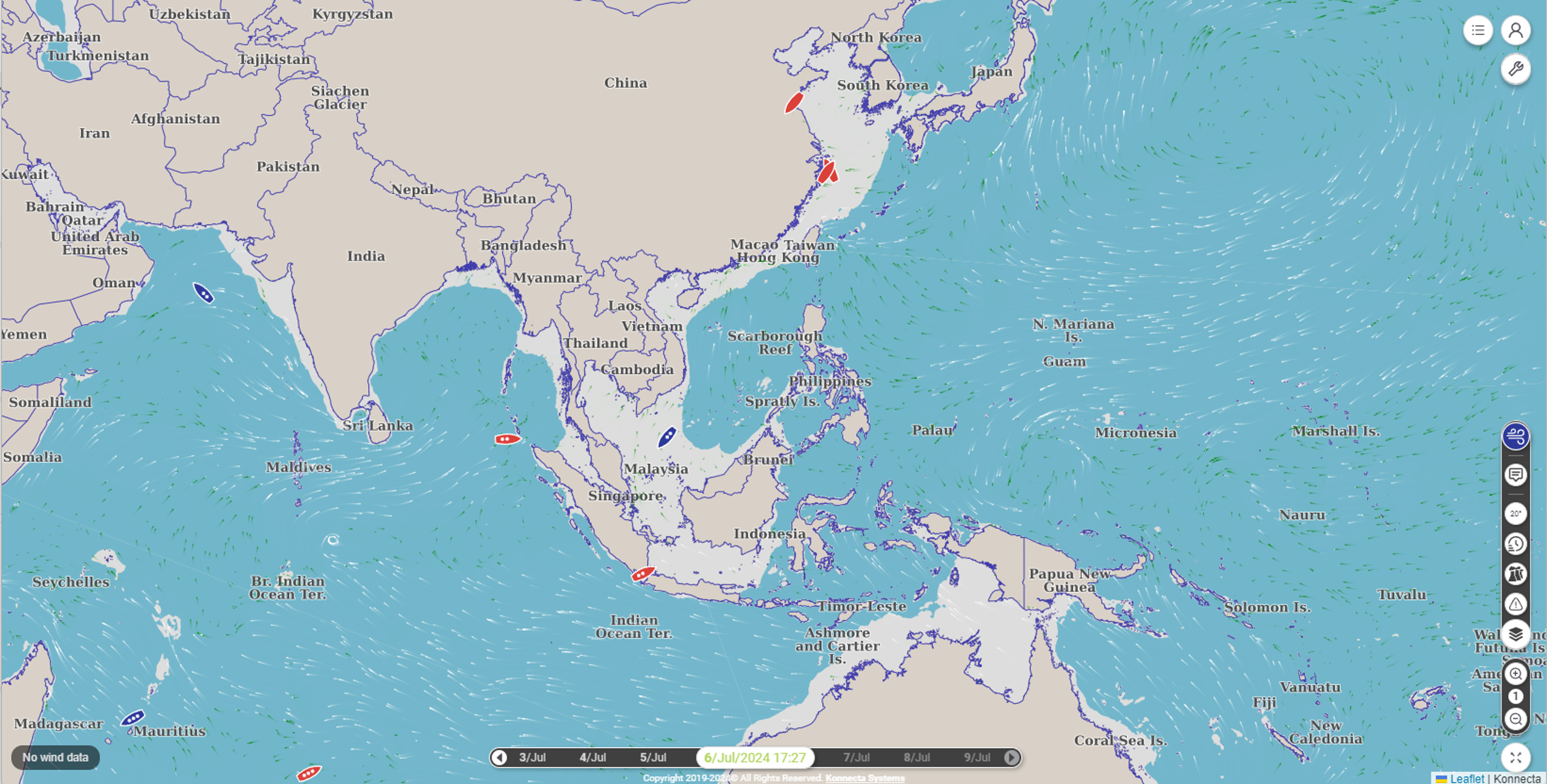
With no vessel selected, the dashboard opens on a regional or global map alongside a vessel list panel. Each vessel is colour- and symbol-coded for immediate screening: loading condition (laden or ballast), a speed-class indicator, and a red flag for any vessel that has gone more than six hours without reporting data. Live weather layers — wind, waves and currents — sit on the same map, and a timeline control lets a user scrub back through recent fleet movement or step to a specific date and time.
Selecting a vessel brings up its overview panel: a header showing the current voyage's origin, destination and progress; operational status; a last-24-hours summary of steaming time, fuel consumption and distance covered; current weather; and real-time sparklines for wind, engine speed, engine load and vessel speed. An engine-loading indicator plots current operation against the vessel's light- and heavy-propeller-curve envelope, and a speed-loss graph tracks the gap between speed over ground and speed through water — both immediately visible without opening a separate analysis tool.
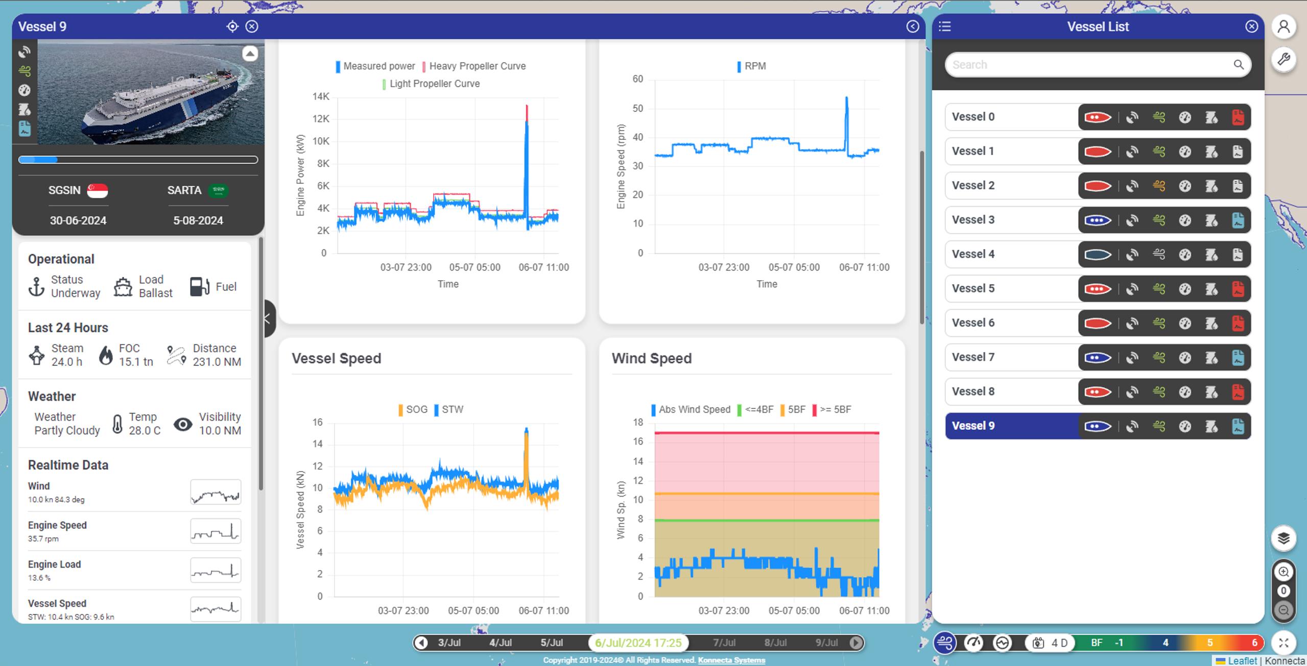
The vessel list itself carries a row of KPI icons — digital-twin system health, weather conditions, speed-loss evaluation, load margin and compliance status — so a user scanning the full fleet can spot the vessel that needs attention before opening it. From there, a detailed information panel offers three further tabs: vessel particulars (identification, build information and dimensions), performance graphs (engine and vessel speed, wind and propeller-slip data with adjustable aggregation), and a paginated voyage history. Together, the redesigned dashboard turns fleet monitoring from a set of separate lookups into a single, consistent view that scales from one vessel to an entire fleet.