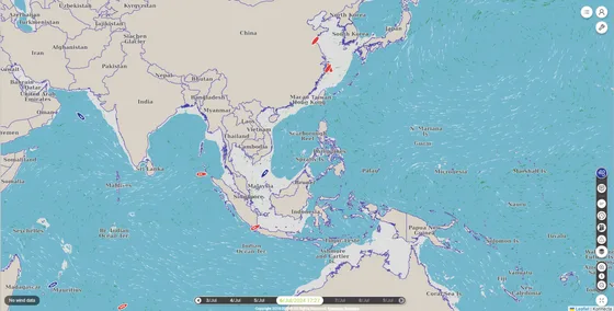
Introducing the Refreshed navIQore Interface
navIQore receives a redesigned visual interface, giving the main dashboard a cleaner and more consistent look — including a clearer Beaufort-scale colour legend and a simplified top-level navigation — while retaining the operational information fleet monitoring depends on.
- Context
- UI
navIQore receives a refreshed visual interface: a cleaner, more consistent look across the main dashboard, with a simplified top-level navigation between the map and tools, while every piece of operational information daily fleet monitoring depends on stays exactly where users expect to find it.
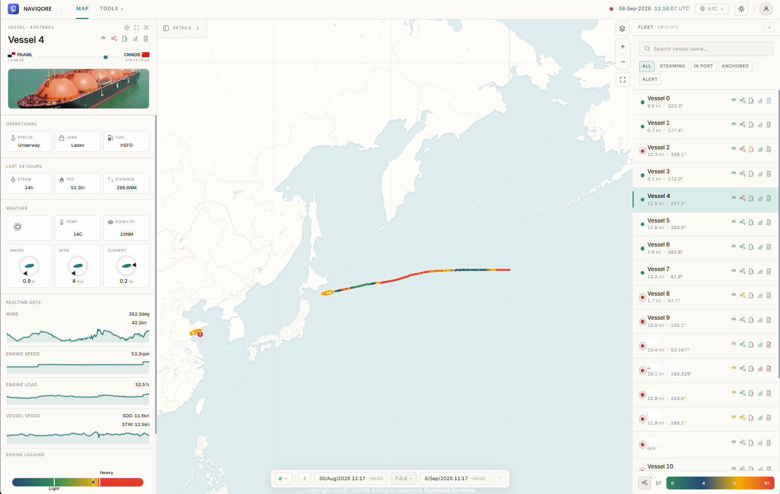
The fleet map, vessel list and per-vessel overview introduced with navIQore's redesigned dashboard remain the backbone of the interface — this refresh is a visual and interaction pass on top of that structure rather than a change to what the dashboard shows. A clearer Beaufort-scale colour legend makes weather-driven risk easier to read on the fleet map at a glance, and tightened visual hierarchy throughout the vessel list and overview panels reduces the effort of scanning a large fleet during routine monitoring.
The result is a dashboard that looks and feels more polished without asking users to relearn where anything lives — a deliberate choice, given how much of navIQore's daily use is built around fast, repeated glances at fleet status.